
En (Cyrillic)
This article relies largely or entirely on a single source. (January 2024) |

En (Н н; italics: Н н) is a letter of the Cyrillic script.
It commonly represents the dental nasal consonant /n/, like the pronunciation of ⟨n⟩ in "neat". And it can be palatized /nʲ/ like in the pair of hard and soft consonnant for the word: жена́ 'wife' and же́нин 'wife's'.
Glyph
[edit]The capital Cyrillic letter En looks the same as the capitals Greek letter Eta (Η η) and Latin letter H. As with most Cyrillic letters, the lowercase form is simply a smaller version of the uppercase. However, in modern Church Slavonic publications, the old N-shaped form is still often used.
It should not be confused with the letter И (similar to a mirrored shape of the Latin letter N):
- The cursive of the capital letter is similar to the English model Copperplate script, with a modification: the line between the two columns is a rising diagonal, exactly as in letter И. And the minuscule, use quite the same ductus (without the loops), leading generally to a rising diagonal too.
- In some handwritten and typographic fonts, these two Cyrillic letters may be difficult to distinguish because they are both drawn with two wide columns (unlike modern Greek and Latin which use wide columns only on the letter H and thin columns on the letter N) and with an almost illegible line between these two columns (the letters use a different angle, but sometimes it's too close to the horizontal and the line can be so thin that the angle is almost invisible).
- In some context (advertising, packaging), it is frequent to see on the same page the modern shape and the previous forms (considered as "Slavic" or "Church" with the "illegible" line).
-
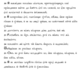
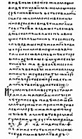
 Modern Russian Cyrillic cursive alphabet used in school education (Н is 15th letter, last letter of the KLMN suite)
 -
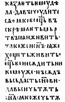
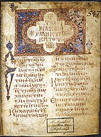
 Example of Russian Church Slavonic computer typography


History
[edit]In the Early Cyrillic alphabet, the letter was created according to the model of the Greek letter Nu. The modifications of the glyph N over the centuries have led to the adoption of the current form of Greek letter Eta (H), a shape that has been formerly used as a model for the letter И.
Theories
[edit]The believing that "the reason En has a horizontal bar, like H, instead of a diagonal line, is to avoid confusion with the letter И" has no groundings:
- The original shapes of letters Н and И were shapes N and H, and were perfectly legibles during centuries. And the Greek and Latin glyphs N and H are both still the same today.
- Difficult to say that the mirrored shapes N and И would be confusing in the same alphabet as latin alphabet has many mirrored letters like b and d, or p and q, and letters very similar like O and Q, or C and G. Even cyrillic alphabet has preserved the very similar letters Б and В (В could have turned into a latin V) or has created a confusion between letters Л and П (formerly Л had a shape of Lambda Λ).
It seems more probable that the change of shapes in Cyrillic resulted from a cascade of consequences, apparently around the letter И, and maybe also letter І and the letter П (see these letters for details of their history).
Initial shape
[edit]From c. 893 in Bulgaria, the Early Cyrillic alphabet was made of uncial greek letters and glagolitic letters. The Cyrillic uncial or "Ustav (script)" (en in Russian) is a style developed on the model of the Greek uncial.
The name of En was нашь (našĭ), meaning "ours". The letter was created according to the model of the Greek letter Nu (Ν ν) as they share the same sound /n/. Therefore the letter had a descending diagonal "\" between the two vertical lines.
At the same time, the letter И was created according to the model of the Greek letter Eta (Η η) for the same reason (sound /i/). Therefore the letter had a horizontal line "-" between the two vertical lines.
In Cyrillic uncial style (as in Greek), for the two letters Н and И (shapes N and H), the vertical columns are drawn wide and the line between is thin.
These shapes are mainly used up to the 13th century, and since the 19th century, in academic publishing to reproduce old Slavonic texts (when ustav-style Cyrillic fonts are used). See for example:
-
-
 Birch-bark letter no. 109, c. 12th century, Veliky Novgorod
 -
 En, from Karion Istomin's 1694 alphabet book


The letter И like an H can still be seen in a book "Arithmetic" from Leonty Magnitsky published in Moscow in 1703 (see the book ШИЦГАЛ А.Г., РУССКИЙ ТИПОГРАФСКИЙ ШРИФТ, page 24), or in a book printed by order of the Tsar in 1706 (see Font of I.Kopievich in the russian version of the article Civil script).
First modification
[edit]In the Cyrillic letter Н with the Greek shape N, the descending diagonal "\" will progressively become shorter:
- the diagonal starts either at the top of the first vertical line, or lower with a very small angle (10 to 20 degrees).
- the diagonal ends in the middle of the second vertical line;
See for example:
-
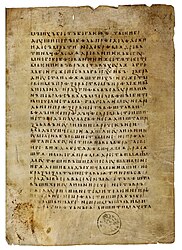
 The Ostromir Gospels, the oldest dated book of Kievan Rus', created in 1056
 -
 The 1186 Miroslav Gospels, Serbian Cyrillic (UNESCO's Memory of the World Register)
 -
 The Gospels of Tsar Ivan Alexander written and illustrated in 1355
 -
 The Andronikov Gospels (gospel of apraxos). Moscow, 1st quarter of the 15th century
 -
 The Lectionary 5, Greek manuscript of the New Testament, 10th century
 -
 The Lectionary 183, Greek manuscript of the New Testament, written in uncial letters, 10th century


,_f.115r.jpg)

One of the explanations may be the management of the virtual line horizontally dividing the letters as А,Б,В,Є,Ж,З,Н,К,Х,Ч,Э,Ю. And this was also applied to the glyph N for some unknown reason (maybe a need for simplification, or to create a styling effect). For example, the scribe draws the horizontal in the glyph H higher than the middle, then the other similar letters will be drawn with a virtual line higher. Therefore, in the glyph N, the scribe must shorten the diagonal and make it end at the level of the virtual line. Then, other scribes repeat the same modifications but sometimes without respecting the same virtual line for all the letters, thus making the root cause disappear.
In uncial Greek, the shape of the letter H sometimes sees the horizontal line rise upwards, and the shape of the letter N either does not change, or moves accordingly, and sometimes we can see both versions in the same text (see Lectionary 5 and Lectionary 183).
Second modification
[edit]From the 15th century, the poluustav (en in Russian) a semi-uncial style developped, and is notably still used today by the Church Slavonic publishing. This style turns into a more fluid writing: there is a slope, letters descending below the line, capital letters, transitional cursive.
In parallel, the first printing fonts are being developed. In 1517, a work of simplification and "romanization" of the Cyrillic alphabet by the first Belarusian printer François Skorina (Prague and Vilnius editions) will give a writing of capitals close to modern. This font was further improved thanks to the Belarusian printer Ilya Kopievich, who from 1700 to 1706, by order of Peter I, published about 25 books in Amsterdam and Danzig. The font of his publications was extremely close to the civil font adopted by the Russian emperor and printed by Pierre Mogiloy in 1708.
In the Cyrillic И with the Greek shape H, the horizontal line "-" has become an ascending diagonal:
- the diagonal starts at the bottom of the first vertical line, in the middle or at three-quarter;
- the diagonal ends either at the top of the second vertical line, or lower with a very small angle (10 or 20 degrees).
See for examples:
-
 The Laurentian Codex in semioncial from 1377
 -
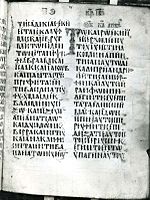
 "Peresopnitsky Gospel", XVI century
 -
 Fonts of the editions F.Skorina (1517) and I.Kopievich (1700)


Therefore, the H-shape for the letter И became less frequent and eventually became available for another letter as... Н. Then the official Civil Script made it mandatory to use the H-shape for the letter Н (in use at that time, see Karion Istomin's alphabet book from 1694) at the detriment of the original N-shape. No specific explanation is available for this choice and if there was a problem with readability, it could have been decided to return to the original shape as in the Greek or Latin alphabet. We can only note that the Church prefers to continue using the old shape, thus refusing to reverse two ghlyphs in the Cyrillic alphabet created specifically to translate the Bible, and thus avoiding repeating the instability of this H-shape (cf. cursive).
Utilization
[edit]- During the transition from Cyrillic to Latin alphabet, the Romanian transitional alphabet used the latin glyphs N and n (or ɴ), instead of the cyrillic glyphs Н and н starting 1846.
- In the Agatha Christie novel Murder on the Orient Express, there is a monogrammed handkerchief, and the "Н" is actually a Cyrillic letter, saying that her forename is Natalia.
- The cyrillic letter "Н" is one of the symbols of the movement of supporters of Russian opposition politician Alexei Navalny. [1]
Related letters and other similar characters
[edit]- Ν ν : Greek letter Nu
- N n : Latin letter N
- И и : Cyrillic letter I
- Њ њ : Cyrillic letter Nje
- Η η : Greek letter Eta
- H h : Latin letter H
- ʜ : Latin letter small capital H
Computing codes
[edit]| Preview | Н | н | ||
|---|---|---|---|---|
| Unicode name | CYRILLIC CAPITAL LETTER EN | CYRILLIC SMALL LETTER EN | ||
| Encodings | decimal | hex | dec | hex |
| Unicode | 1053 | U+041D | 1085 | U+043D |
| UTF-8 | 208 157 | D0 9D | 208 189 | D0 BD |
| Numeric character reference | Н |
Н |
н |
н |
| Named character reference | Н | н | ||
| KOI8-R and KOI8-U | 238 | EE | 206 | CE |
| Code page 855 | 213 | D5 | 212 | D4 |
| Code page 866 | 141 | 8D | 173 | AD |
| Windows-1251 | 205 | CD | 237 | ED |
| ISO-8859-5 | 189 | BD | 221 | DD |
| Macintosh Cyrillic | 141 | 8D | 237 | ED |
References
[edit]- ^ "Дальше – арест за запятую?!" Майор Удод нашел экстремизм в букве Н". Sibreal (in Russian). Retrieved 10 July 2024.